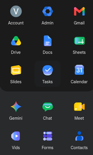
Whoever's promotion was riding on the landing of the new #Google icon revamp needs to reconsider life and perhaps pursue becoming a potatoe farmer.
@vbatts I just assumed they had got Gemini to design them.
To me they kinda feel a bit Windows XP.
Not that Google has great history when it comes to icons.
Time for a cuppa... Earl Grey please!